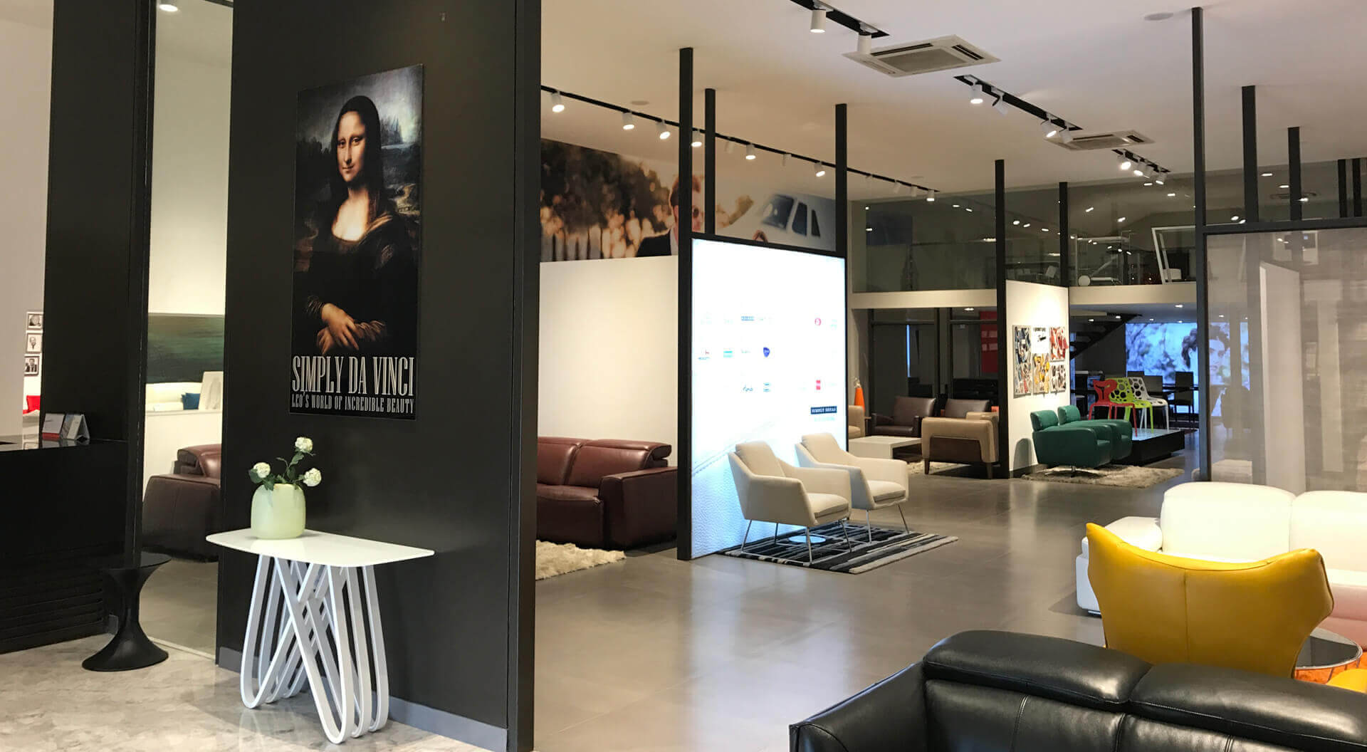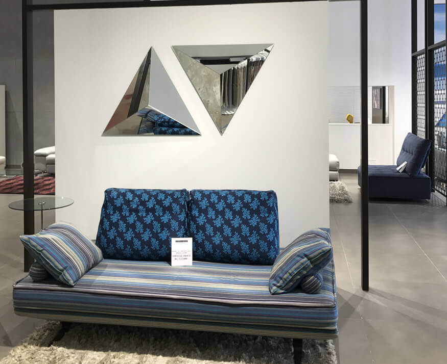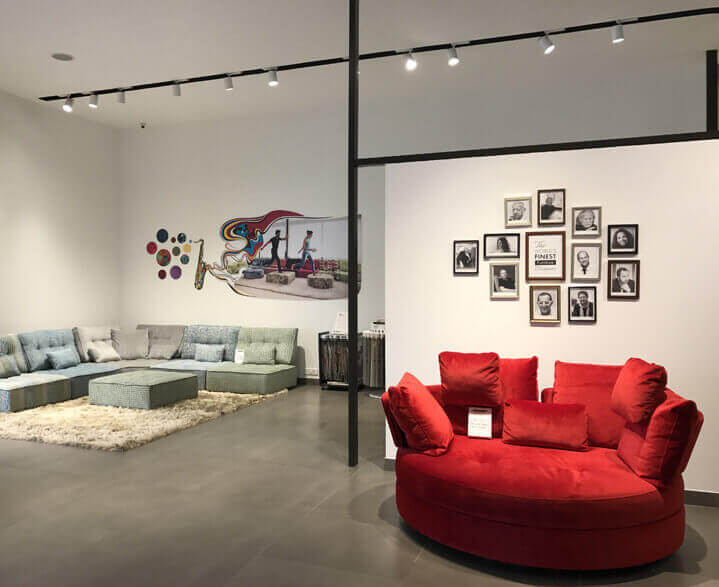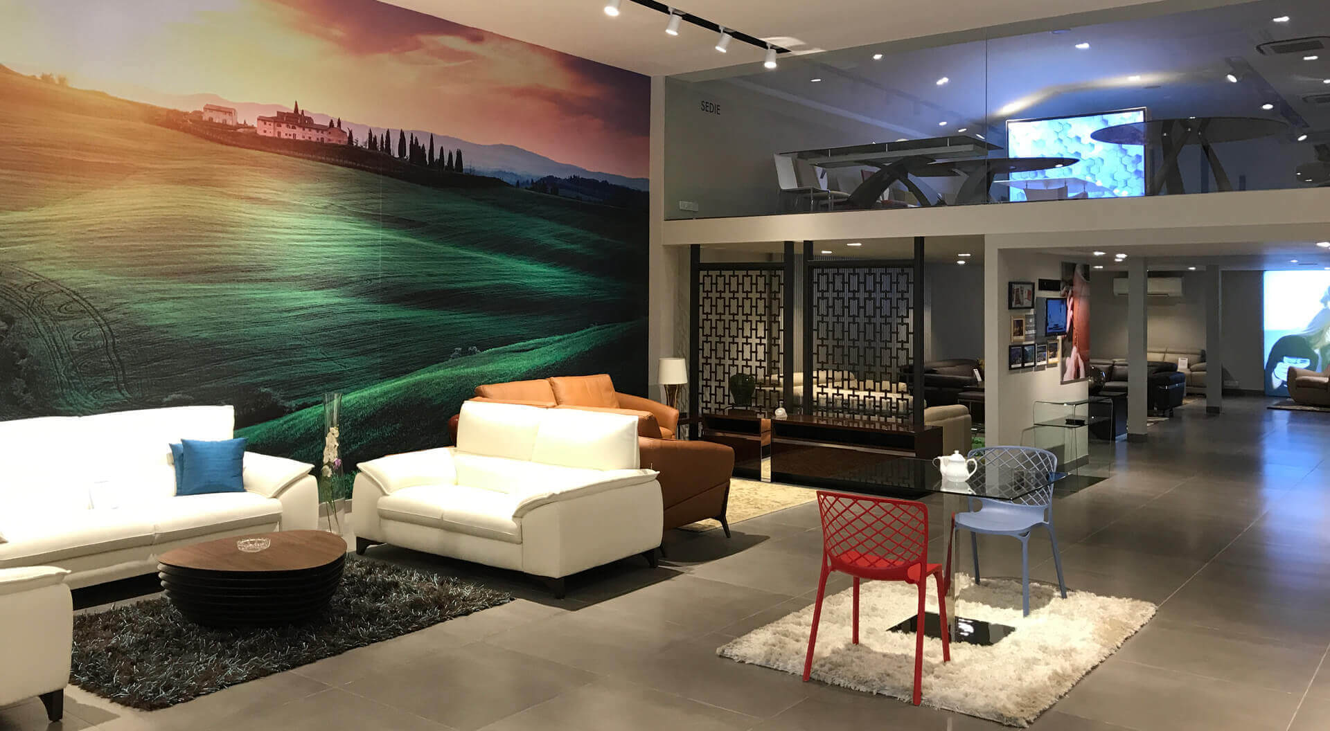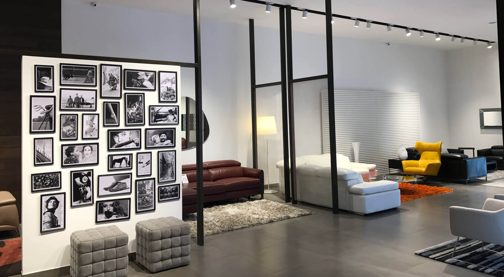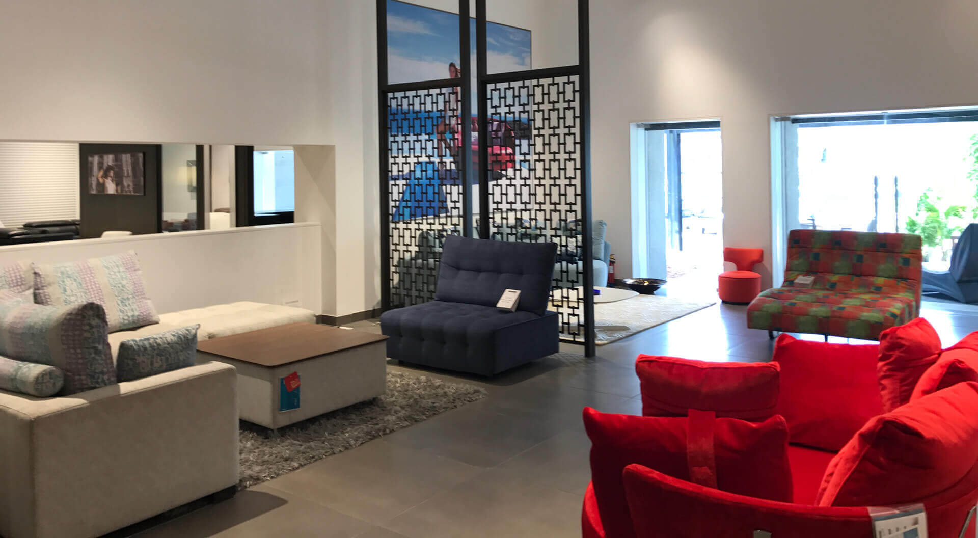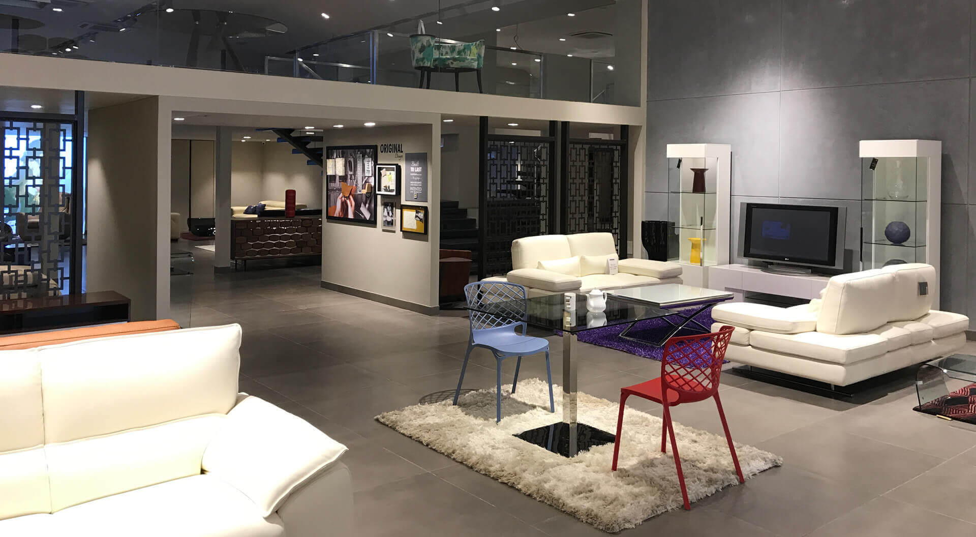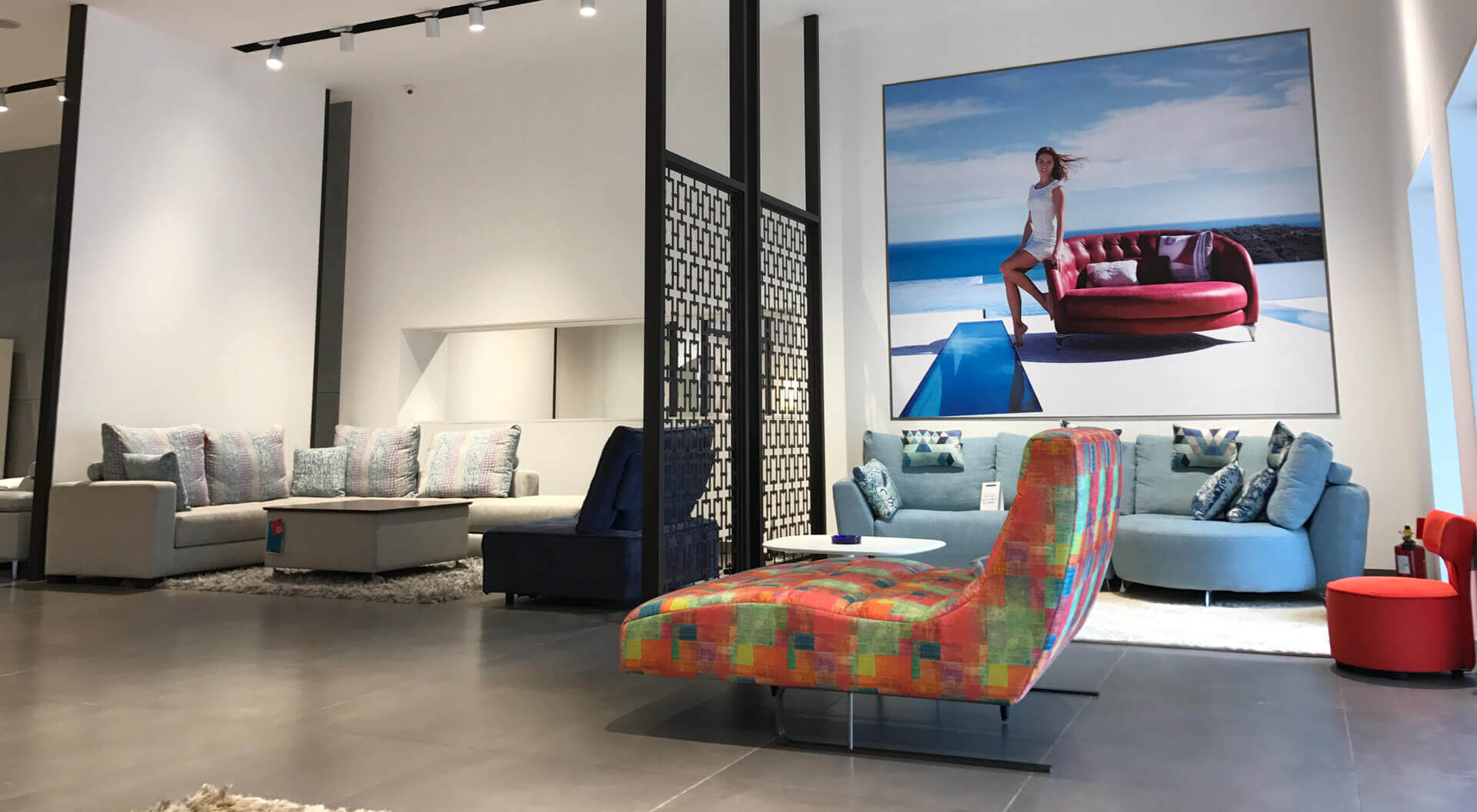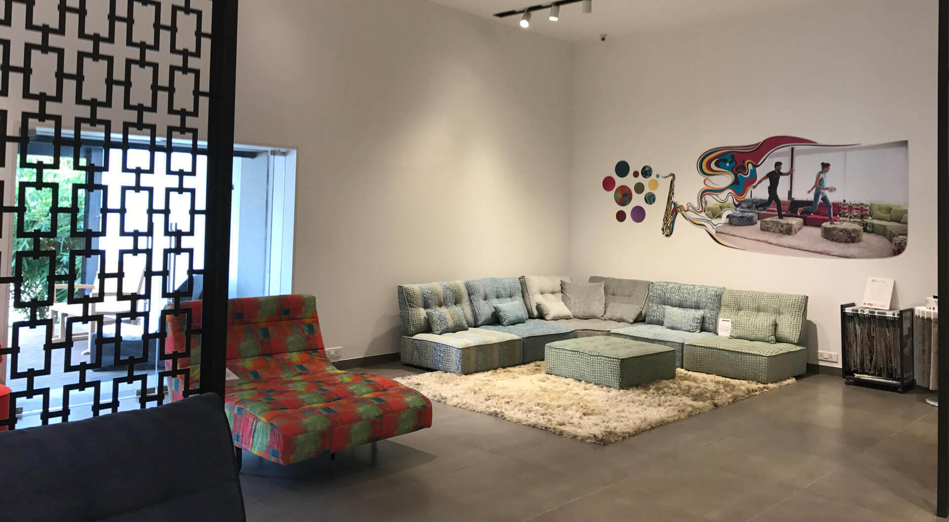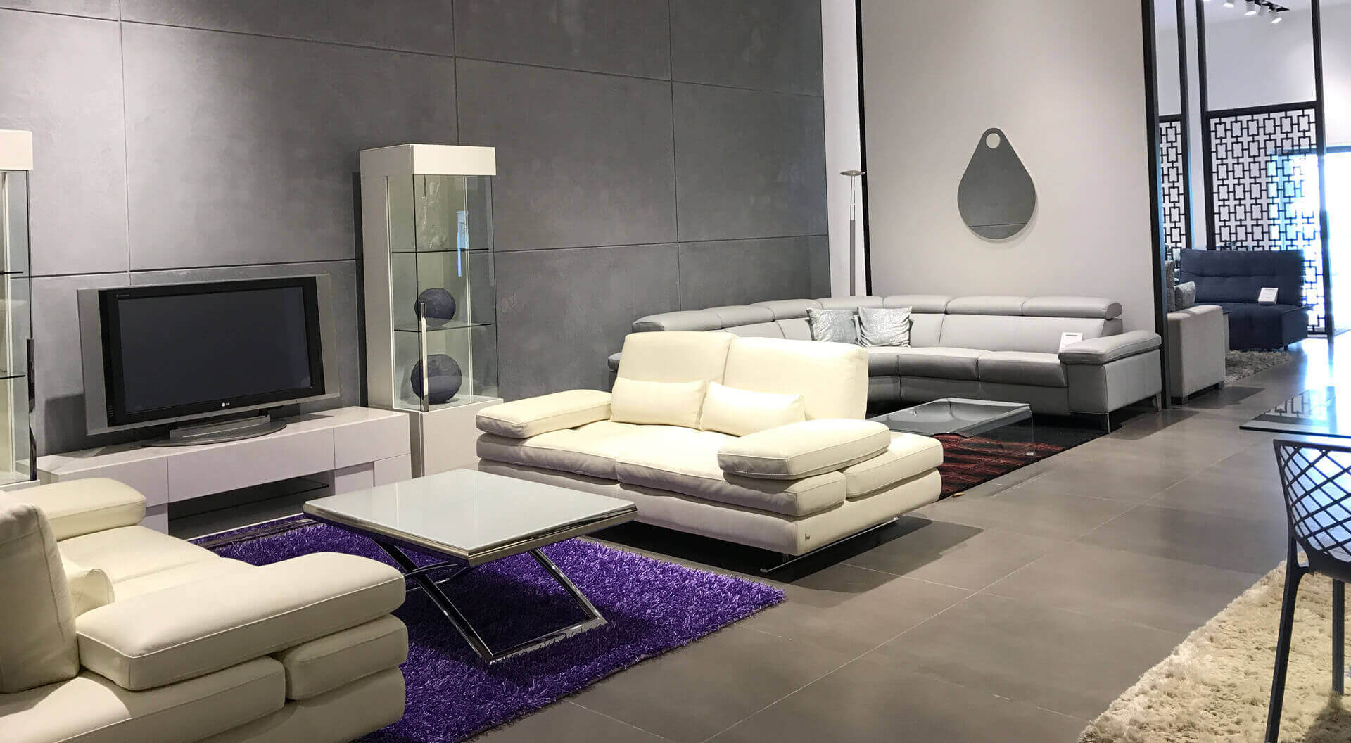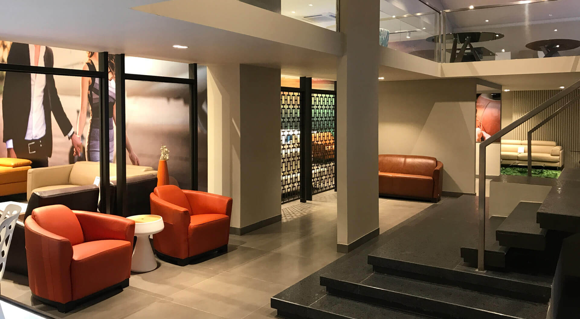

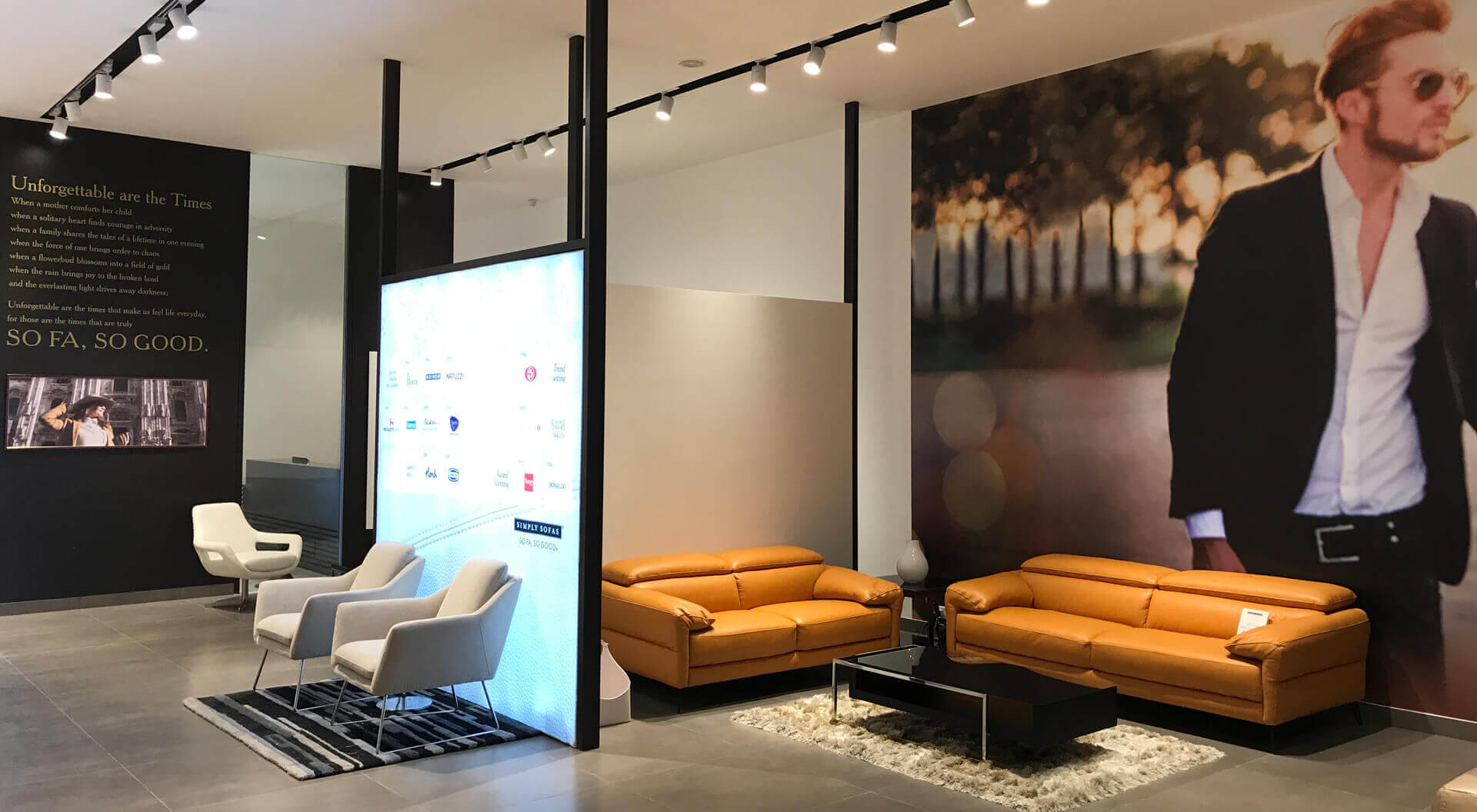
Simply Sofas is a leading retailer of European furniture. Their collection includes brands from Italy, Germany, Norway and Spain. We recently redesigned two of their interconnecting spaces – each space was an old industrial shed measuring 30X100 feet, having a high-pitched roof. The plan was to effectively utilise the depth and height of the space and showcase the various brands in our client’s collection. To do this we first inserted a mezzanine floor which covered 1/3 rd of each adjacent space. We then designed a metal staircase in each bay connecting each one of these mezzanines to their lower level. A bridge also linked one mezzanine level to the other. We divided the lower level into seven bays on either side of an ambulatory spine running down the middle. Each bay was designed to accommodate a living room set or dining room set complete with all the accessories. We designed floating dividers interspaced within the showroom space. These floating dividers were either solid or transparent. The solid dividers acted as backdrops for the displayed furniture and also defined the bay physically. Transparent floating dividers gave visuals of adjacent furniture display base, and also guided the customer through the showroom. Transparent dividers also gave a glimpse of what is to come and kept the customers interested in seeing the rest of the showroom.
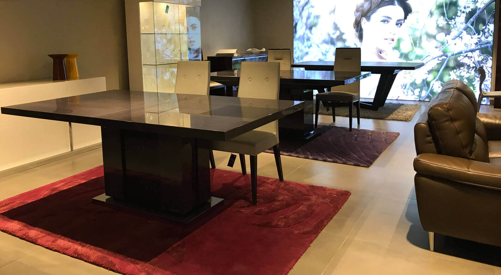
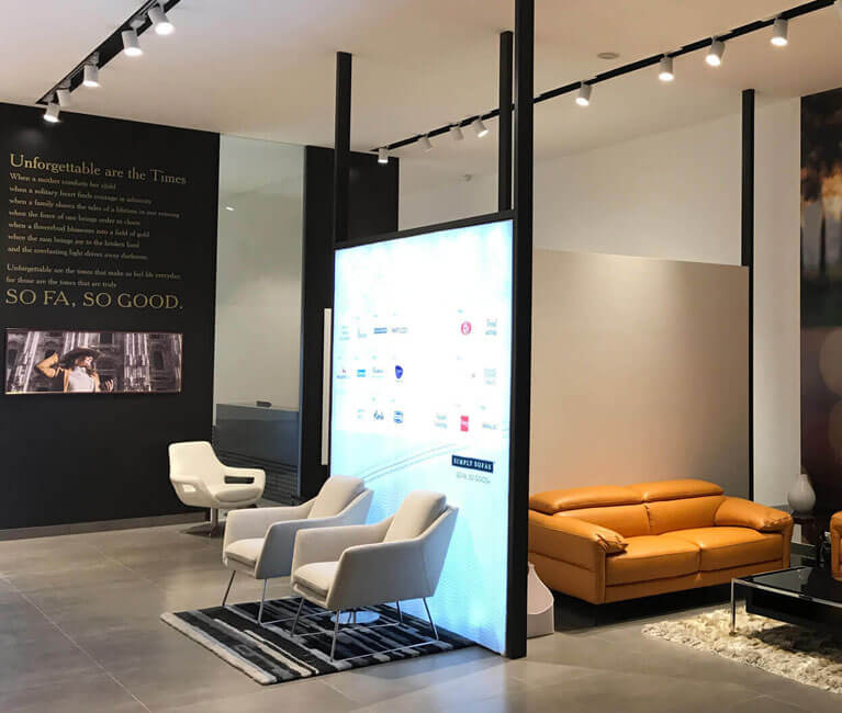
Large backlit panels of interesting visuals created highlights and backdrops for the displayed furniture. The recessed track lighting was designed in such a way so as to accommodate for flexibility and change in the furniture display. The stark white walls and ceilings allowed the furniture to stand out. Certain highlight walls were treated in the form of patterns or cement finished walls to create a backdrop for the furniture.
